What is the Best Factory Size?
When planning a new factory, product cost and total fixed cost obviously depend on the factory’s planned capacity. The larger the factory, the more economies of scale will lower product cost. However, large factories require more capital equipment. To quantify these effects, use Factory Explorer®’s Product Cost & Total Fixed Cost vs. Start Rate Chart, shown below for Factory Explorer®’s sample Aspen model (based on data from SEMATECH’s set4 testbed dataset). These results were generated using capacity analysis – no simulation was required.
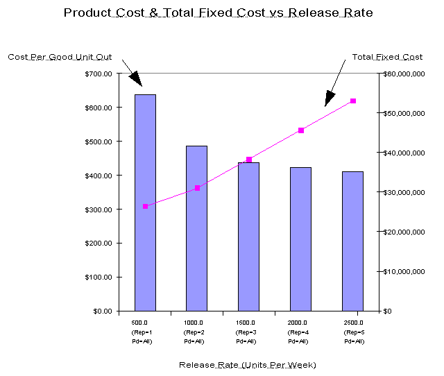
duct Cost & Total Fixed Cost vs. Start Rate Chart, Aspen model. This chart quantifies the tradeoff between factory capacity, product cost, and total fixed cost. For this analysis, a minimum toolset is generated for each start rate, based on a suggested capacity loading% of 85% (this figure can be controlled with run-time options). Economies of scale are much smaller above 2,000 unit starts per week, while a $40,000,000 factory can support approximately 1,500 unit starts per week.
Starting with a factory model and with the question What is the Best Factory Size?, it takes only a few minutes to generate the chart above. You specify the number and range of release rates to investigate, and tell Factory Explorer® to use its own calculated minimum toolset rather than the toolset specified in the factory model. For each release rate, Factory Explorer®’s capacity analysis engine generates the toolset, costs it out, and performs detailed product cost analysis (if you choose to model operators, Factory Explorer® can also generate minimum staffing levels and include them in product cost). Factory Explorer®’s chart engine automatically creates the output chart. Now you have the information you need to make a strategic business decision. What’s more, it’s easy to iterate this analysis for different business assumptions (process learning, tool availability, etc.) since each iteration is so fast. Getting to the answer has never been easier.
How Much Slack Capacity Should Be Reserved?
When planning the toolset for a new factory, the amount of slack capacity reserved across all tools is an important variable. For a given start rate, reserving a large amount of slack capacity usually produces a good cycle time, but forces additional capital equipment purchases. To quantify these tradeoffs, use Factory Explorer®’s Fixed Cost & Cycle Time vs. Suggested Capacity Loading% Chart, shown below for Factory Explorer®’s sample Aspen model (based on data from SEMATECH’s set4 testbed dataset). These results were generated using both capacity analysis and simulation.
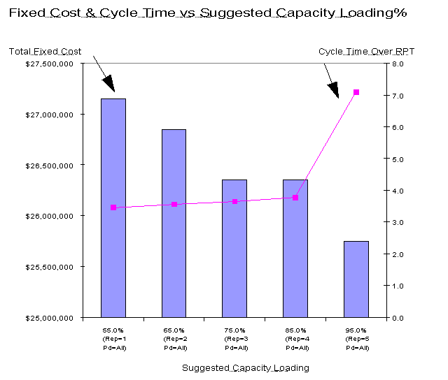
Fixed Cost & Cycle Time vs. Suggested Capacity Loading% Chart, Aspen model. For this analysis, the start rate is held constant, and a minimum toolset is generated for each suggested capacity loading%. Reserving a large amount of slack capacity (setting the suggested capacity loading% to a low number) drives the total fixed cost up significantly, but ensures a low cycle time.
Since Factory Explorer® integrates capacity analysis and simulation, it can create the chart above with a single analysis run. Factory Explorer®’s capacity analysis engine generates a minimum toolset for each suggested capacity loading (a parameter you control at runtime). Then, using this toolset, Factory Explorer®’s simulation engine estimates the resulting cycle time. Factory Explorer®’s chart engine automatically creates the output chart. There is no need to maintain one model for capacity and one model for simulation. Factory Explorer® lets you analyze both with a single factory model, and offers cost analysis as well. Factory Explorer® is a complete decision support tool.
How Much Does Cycle Time Reduction Cost?
One way to ensure good cycle time is to reserve a large amount of slack capacity. It’s an expensive way to plan, however (see How Much Slack Capacity Should be Reserved?). An alternative is to start with a minimum cost toolset that has a small amount of slack capacity, and then add tools only where they are needed for cycle time reduction. Cycle time reduction results can then be summarized as shown below (representative data; actual customer data is proprietary). These results are based on both capacity analysis and simulation.
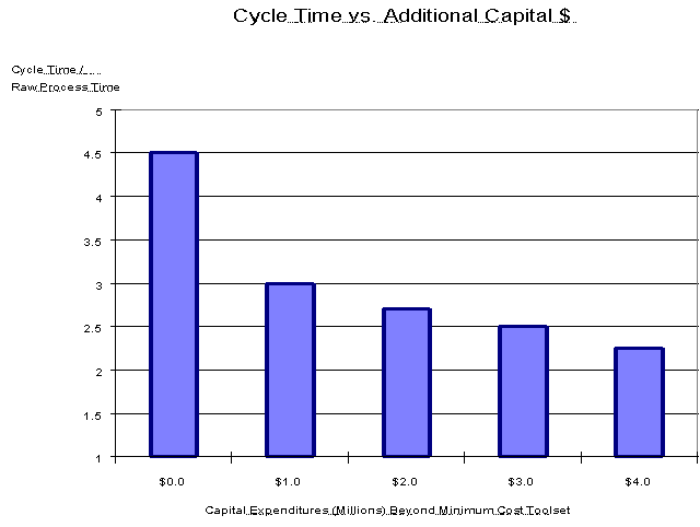
Cycle Time vs. Additional Capital $ Chart, representative data. Each bar represents a cycle time estimate for a specific factory toolset. The goal of this analysis is to add tools so as to make the reduction in cycle time as steep as possible when measured against capital equipment expenditures. Factory Explorer® does not generate this chart automatically, but it makes it easy to do the underlying analysis.
This analysis is an example of iterative factory optimization. Using Factory Explorer®’s capacity analysis engine, you first generate a minimum cost toolset with a small amount of slack capacity. Next, use Factory Explorer®’s simulation engine to estimate the cycle time contribution of each tool in the factory (See What are the Top Cycle Time Contributors?). Using data from Factory Explorer®’s cycle time contribution chart, it’s straightforward to add tools so as to maximize the cycle time reduction per dollar of tool fixed cost. Each bar in the chart above represents one iteration in this optimization process. The potential financial benefits are huge – it’s the difference between buying a few targeted tools and buying slack capacity on every tool in the factory. Factory Explorer® makes it possible.
How Does Factory Loading Affect Product Cost and Cycle Time?
Factory loading affects both product cost and cycle time. The closer the factory as a whole runs to its capacity, the lower product costs will be. However, running close to capacity often drives cycle time higher. To examine the tradeoff between capacity loading, product cost, and cycle time, use Factory Explorer®’s Cycle Time Characteristic Curve Chart, shown below for Factory Explorer®’s sample Aspen model (based on data from SEMATECH’s set4 testbed dataset). These results were generated using both capacity analysis and simulation.
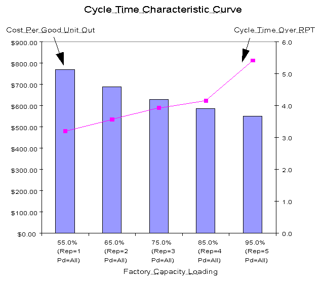
Cycle Time Characteristic Curve Chart, Aspen model. This chart quantifies the tradeoff between factory capacity loading, product cost, and cycle time. For this analysis, the toolset is held constant and the start rate is varied. Cycle time rises quickly when the factory is loaded above 85%, while product cost decreases linearly as the loading increases.
Factory Explorer®’s cost analysis engine is a comprehensive system that considers costs at all levels – from factory overhead all the way down to process step materials and consumables. This costing engine provides multiple views of the factory’s financial health, including detailed product cost and gross margin outputs. Since the chart above can be created automatically from a single run of Factory Explorer®, it’s easy to perform sensitivity analysis, where the performance measure in question is the shape of the cycle time curve. The goal is to shift this curve down and to the right, thereby making it possible to run at higher loadings with lower cycle times. With Factory Explorer®, you can test out potential improvements (tool dedication reduction, capital equipment expenditures, staffing changes, etc.) and quickly see the impact not only in terms of cycle time, but also in terms of cost. For the first time, you can easily perform engineering analysis and financial analysis simultaneously.
What are the Top Capacity Constraints (Bottlenecks)?
For a given tool set, product mix, and start rate, one tool or operator group will constrain factory capacity (e.g. the bottleneck resource). However, even if this top capacity constraint is lifted by adding tools or operators, or making other improvements, there may be other capacity constraints lurking just behind. To see all capacity constraints at once, use Factory Explorer®’s Bottleneck Resource Chart, shown below for Factory Explorer®’s sample Aspen model (based on data from SEMATECH’s set4 testbed dataset). These results were generated using capacity analysis; no simulation was required.
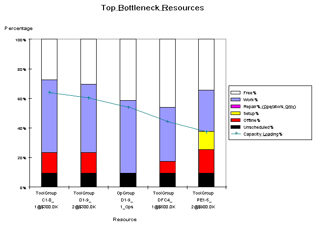
Bottleneck Resource Chart, Aspen model. This chart displays top capacity constraint resources (tool groups or operator groups) and the time spent by each resource on various tasks. Tool groups C1-9 and D1-9 are the top capacity constraints, but the factory has a significant amount of spare capacity (over 30%).
Finding capacity constraints using simulation is a difficult task, especially if the factory is overloaded. After you find and relieve each bottleneck, you have to re-run the simulation to find the next one. But with Factory Explorer®, you can use the capacity analysis engine to identify all bottlenecks. With this engine, a single run identifies all capacity constraints, even for overloaded systems. And, it’s fast. Even for large factories, the capacity engine often requires only a few minutes. This speed does not come at the price of detail, however, as the capacity engine accounts for operators, rework, scrap, lot splitting, Kanbans, and a host of other complexities commonly found in advanced manufacturing. You don’t have to simulate to solve every problem. With Factory Explorer®, you can use the right tool for the problem at hand. Think of it as your hi-tech toolbox.
What are the Top Cycle Time Contributors?
In contrast to capacity improvements, which must first target bottleneck resources, cycle time improvements can be made at any tool within the factory. However, cycle time reduction opportunities are usually best focused on the tools that contribute most heavily to overall cycle time. To determine these tools, use Factory Explorer®’s Cycle Time Contribution by Tool Group Chart, shown below for Factory Explorer®’s sample Aspen model (based on data from SEMATECH’s set4 testbed dataset). These results were generated using both capacity analysis and simulation.
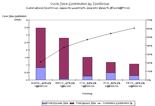
Cycle Time Contribution by Tool Group Chart, Aspen model. This chart displays the tool groups that contribute most heavily to cycle time. Although it is not heavily loaded, tool group QLESS is responsible for nearly 20% of total cycle time for this product. Understanding and reducing this tool group’s cycle time contribution could reap substantial benefits.
You could create the chart above using outputs from other simulation tools, but the necessary data is often buried in text-based output reports. You would have to copy and paste the data to Excel, create the chart manually, and worst of all – repeat the entire process after each simulation run. With Factory Explorer®, it’s an automated output chart that’s available at the touch of a button. Because we use Factory Explorer® every day, we are among its most demanding users. We solve problems and add capabilities – like automated output charts – ahead of customer needs. Once you start using Factory Explorer®, you’ll appreciate this innovative drive.
What is the Trend in WIP and Cycle Time?
In any complex factory, WIP and cycle time vary as time passes. Understanding and controlling these trends can significantly improve a factory’s on-time delivery performance. To see how a factory’s WIP and cycle time change over time, use Factory Explorer®’s WIP and Cycle Time by Period Chart, shown below for Factory Explorer®’s sample Aspen model (based on data from SEMATECH’s set4 testbed dataset). These results were generated using simulation; no capacity analysis was required.
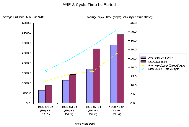
WIP & Cycle Time by Period Chart, Aspen model. The significant rise in WIP and cycle time in this factory makes it likely that the factory will soon have trouble meeting delivery dates.
With Factory Explorer® you have the ability to ramp all product, tool, operator, and process step attributes within a single model. You simply tell Factory Explorer® the real-world dates when changes occur, and it takes care of the rest. What’s more, all of this data is stored in a single Factory Explorer® model. The days of creating separate models for different time periods in the factory life cycle are over. When you run Factory Explorer®, you tell it the starting date for the analysis, the run length, and the length of each analysis period (days, weeks, months, quarters, etc). Outputs are displayed for each analysis period, as in the chart above. Many outputs are also summarized across the entire replication, or the entire run if multiple replications are performed. Factory Explorer® – it’s what modeling always promised but never before delivered.
Call today for more information from Wright Williams & Kelly, Inc. Unlocking the Future of Innovation with Digital Twins Since 1991.